Scale and explainability no one else combines.
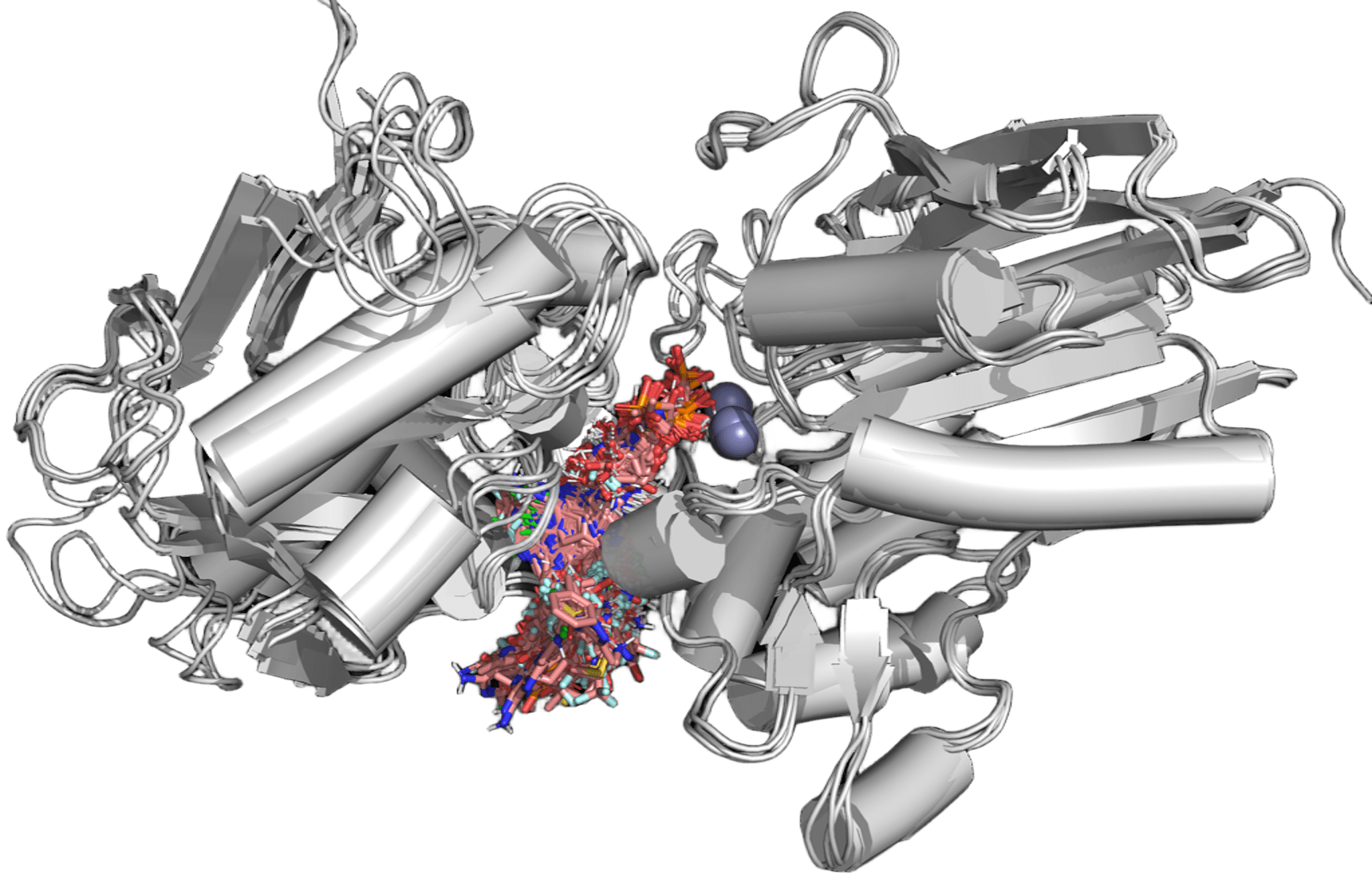
Physics-based docking suites are explainable but stop at Molecular. Phenotypic-imaging platforms reach Cellular — as image correlations, not physics. Generative AI platforms span similar scale to ours but as black boxes. PK/PBPK and trial-simulation tools operate only at Tissue and above. Deep Origin combines Quantum-through-Cellular coverage with explainable physics throughout — and ARPA-H extends the roadmap further.
Learn more about our ARPA-H Program QuantumMolecularMacromol.CellularTissue+
- Deep Origin
- Physics-based docking suite
- PK/PBPK & trial-simulation tools
- AI structure prediction platform
- Phenotypic-imaging platform
- Generative AI platform
Deep Origin’s coverage extends through Tissue and beyond on the ARPA-H roadmap.